Lesson 5: Garrett's Elements of UX
UX in Digital Design
Above all, this course is about effective design of interactive solutions. But how do we determine whether something is "effective?" Is it a matter of making profit? Is it about a complete and functional product or solution? Or is it about the experience our users have with the solution?
Perhaps it is all of these. Let's dive into our first set of content from Jesse James Garrett's text, The Elements of User Experience.
Read Chapter 1 from Garrett.
Garrett's Elements of UX
Lets learn more about the five planes of user-centered design. As a designer, you'll probably tend to think first about the way something should look. But the planes Garrett explains provide a richer context for the visual (surface) aspect.
Read Chapter 2 from Garrett.
Our project processes in this course will largely mirror the planes outlined here. First we'll set the goals of an application (strategy). Then we'll move on to do some research and determine the requirements (scope), then develop personas and task flow diagrams (structure) followed by wireframes, which we will test extensively (skeleton). Finally, we will skin those wireframes and string them together to create a prototype (surface).
Planning Visual Style
While we stress thorough planning of our interactive solutions using user-centered design, research, and loose deliverables such as wireframes, we can also plan our visual style elements before we actually create mockups. Style Tiles are a tool for accomplishing this. Hopefully you've been introduced to this in previous classes, but the original idea is documented at http://styletil.es/. We provide a Sketch template for style tiles in the project deliverables.
Crucial Notes on Color
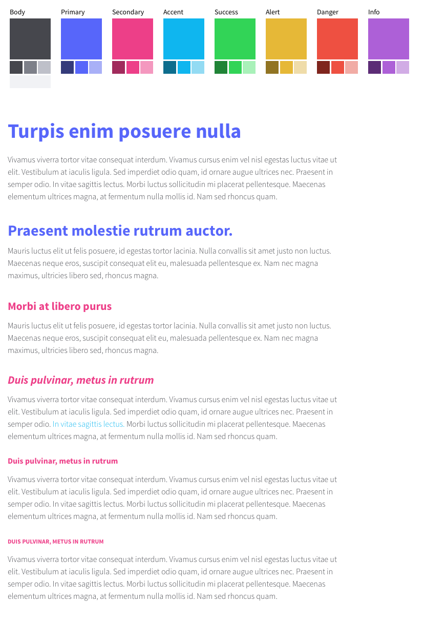
Colors in interactive design present some new aspects you might not be used to planning. In interactive work we rarely can make a usable solution with just a color or two. Inevitably we need some different colors to draw attention to different aspects or states of components in our system. At the least, this can include a "success" color (often in the green range) and a "danger" color (often on the warm end of the range). At the end what is often helpful to do for interactive design is to select a complete family of colors. This way you get the full palette in front of your stakeholders for signoff even if you really expect to just use a few select colors according to common design practice. So while the style tile template we provide in this class allowed for several optional color panels I'd like to see you all use these more intentionally.
Along these lines, what we also often see is students using one or more panels to display several very similar colors. Please avoid this! We believe it goes without saying that a given hue might be used at various tints or shades. We have sometimes taken to showing these variations in smaller thumb tiles below the main tile. See the examples below. Don't waste space showing several similar hues; make each choice interesting, purposeful, and distinct.
Here is a sample of a thorough color palette:
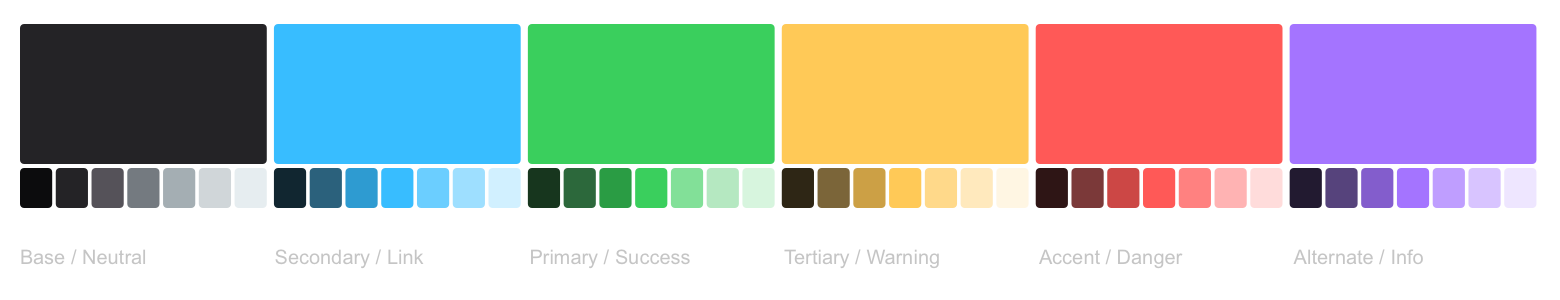
Focusing in on the four "required" color panels for a moment:
- Primary and secondary ought to be at least your brand colors that are rather non-negotiable given the company's brand. And if such a brand isn't established, consider showing here the two colors you think are most important to use for prominent elements. Sometimes a brand actually will restrict their primary color to ONLY be used in the logo and company name and not anywhere else in a branded document. That's OK. We want that color articulated here so that we con select other colors that pair well with it.
- For the "body" color we typically choose something that has high contrast with the most common background in our site and is not a flashy color to make the humdrum body copy too busy. I'm usually in the dark, desaturated range of one of the primary colors with this selection that usually establishes an on-brand grey I can use in a variety of tints and shades but generally with only a hint of distinguishable hue.
- Finally, with the accent or hyperlink color, we want a color here that fits with the others but is also distinguishable from the body copy and has sufficient contrast with the most common background. If this can land in the blue hue range that's also a safe convention to keep on the web, but not absolutely required. If one of your primary colors is a blue you could choose to use it exclusively for hyperlinks but do so intentionally and carefully.
- If you choose these four colors well to ensure they're distinct and intentional you can usually fill in the other hues in a family pretty easily. As the first primary bullet point calls out I usually add a green hue if one is not already in play to use for "success" states of buttons and icons or other relevant components, and an orange or red for a "danger" state such as a warning message or error flag.
Last of all, show these colors in your type samples below the color panels Put them to tasteful use to show how you'll use them to liven up your text and carry over the brand. It usually helps as well if these colors are compatible if not contained in the sample images you show.
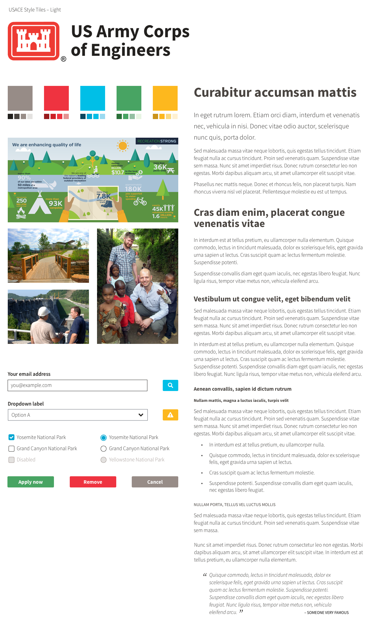
Sample 1: USACE Careers Style Tiles
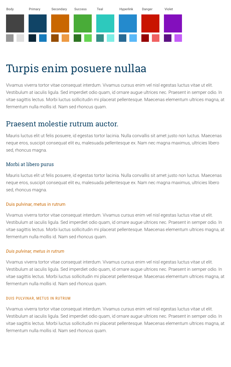
Sample 2: Bereans at the Gate Style Tiles
Sample 3: Custom UI Style Tiles